What’s in my Bag/What I Wore: CES2024

Intro

This year was my first time at CES and it was equal parts fascinating, overwhelming, and inspiring! After worrying about traveling delays (which ultimately did happen), I started worrying about what to pack for CES. While I’ve already written about some work takeaways and observations, I wanted to give you a behind the scene of what outfits and footwear I went with and what I carried in my daily bag.


Outfits and “Business Casual”

The dress code for CES is business casual, which in my opinion, is complicated in 2024. As someone who works from home most of the time and works for a university, my outfits are probably a little more “daring and comfortable” than “business casual.” From my outfits to my shoes to my bag, I kept worrying about fitting into the CES crowd. 

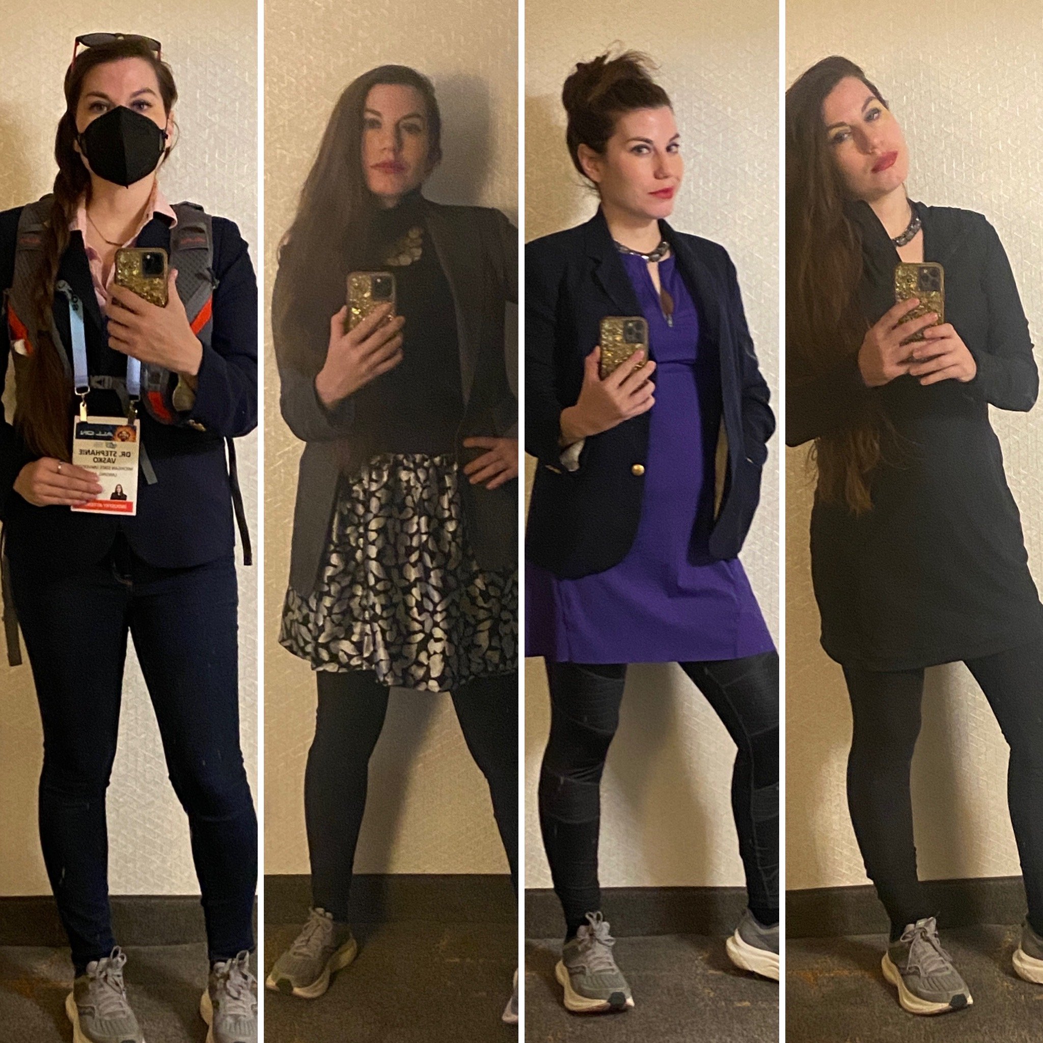
Having not worked in a space with traditional business or business casual dress codes in quite some time, I decided to do what I do best: research. Ultimately I realized that the only way to feel comfortable at CES was to be myself and pair some of my dressier athleisure pieces with business casual staples. I created a capsule wardrobe of mix and match pieces that I could layer including two athleisure dresses, a self-made skirt, two button downs, two thrifted blazers, one pair of jeans, one sweater, two pairs of black leggings, and silver jewelry. This allowed me to mix and match on the fly and transform outfits from day to night or adjust to heating changes. Did it work? Absolutely. I didn’t use all of the pieces I brought, but having a few extra options helped when I needed to adjust for temperature or for how much I would be walking on particular days. There were 135k+ people at CES this year and I saw everything from business suits to high fashion dresses to t-shirts and jeans. Bottom line? Wear what makes you feel powerful and comfortable and don’t be afraid to mix in pieces of your authentic style.

Four Days of CES outfits (All image rights reserved)

Footwear/care

One of the biggest things I heard about CES was how much walking I was going to be done while there. I asked a few former CES attendee friends and colleagues about what they had done or were doing about footwear. After these discussions and some soul searching, I decided to wear my current stability running shoe (Saucony Tempus) for the conference. In the end, my comfy choice was the right choice for me and allowed me to fit in as many attendees were in sneakers. I paired my sneakers with compression socks (a clutch tool in my long distance runner life), and given that I wound up walking/hiking 45+ miles on my trip, I was VERY happy with this decision. 

My bag

I don’t use a shoulder bag (especially in light of my arm injury), so I contemplated using my normal backpack. At the end of the day, I felt like this was too big and bulky and would give me the unnecessary temptation to carry too much all day. 

Instead, I took my Alps Mountaineering Hydro Trail 10 day hiking bag (without the water bladder and hose). What I especially like about this particular bag are the chest straps and waist strap, allowing me to fit it to my body and take weight off my shoulders or back. The front pockets allowed me to keep my cough drops and hand sanitizer close at hand, as well as keep a water bottle in my vision to remind me to hydrate.

What’s in my bag/pockets

(All image rights reserved)

The following is a quick tour of the things that I (mostly) carried every day of CES, starting from the top left of the image above.

First row:

1: Cough Drops: I bought a big bag of store brand honey lemon cough drops and brought those from home. I like having something small on hand to help with things rom coughing spells to bad tastes.

2: Corded Headphones: When it comes to headphones, I never want to worry about batteries and charging. I also like to signal to others that I have headphones in, so I wore this smaller pair and kept my trademark over -the-ear pair  in the hotel room.

3: Fruit and Nut snackpack: You never know when a snack will or will not appear, so I like to make sure I’m prepared for hunger pangs. These Target ones have a combo of fruits, nuts, and seeds. 

4: Small notebook: I brought this very on-brand one with me, but wound up not using it because taking notes on my phone was faster and easier on my injured arm. 

5: Blistex: Vegas is dry, chapstick is a must. And by one chapstick I mean, bring five. I like this mint one, especially when I am masking. 

6: Pen: To take notes with…I used mine to write notes on business cards.

Second row:

7: Hand sanitizer: I knew I’d be touching a lot of things that other people have touched. With the flu/RSV/COVID threats, and having just recovered from bronchitis, I wanted to take every step I could to keep myself safe. Also, there MANY times I’d ask a company to clean a headset or something I’d be putting on my body and they hadn’t been doing it. 

8: USB to X cable: Needed for my external battery and I like to be prepared.

9:  Extra hair band: I have very heavy, very long hair. Hair bands break and get lost, so I like the security of an extra. 

10: External Battery: I knew I’d be on my phone all day, so wanted to make sure I was charged the whole time. This is the smaller of the two I brought with me. These both got topped off at night.

11: Bandaids: Walking a lot of miles means the possibility for blisters, constant dry air means the possibility for cuts. I like being prepared for all occasions. 

12: Gu: The ultrarunner in me loves Gu. Caolories, electrolytesm, and caffeine in a little packet. While this is not my particular favorte flavor (jet blackberry is), these do in a pinch if you can’t find some quick food or coffee. I use one every 5 miles/1 hr when I am running. 

Where is your computer?

I brought a chromebook on this trip; but quickly realized it was going to be faster/lighter for me to move to phone only during the day and notebooks/chromebook when in the hotel room. I don’t regret this decision at all.

Additional Bag Items Not Pictured

Masks: I wore a KN-95 mask the whole time. I was definitely in a small minority of people doing this, but after last year, my personal calculus errs on the side of still masking in public at all times. In addition to the one I was wearing every day, I also had a backup in my bag. You could get them from the CES Info desk at XYZ. 

Hydration Options: From Vegas dryness to the hotel room dryness to the walking, you are going to get dehydrated on this trip. So I’m going to tell you to get water, BUT also, make sure you are also getting enough salts. I took a prep trip the night before, went to Target, and got a gallon of water, some packs of lacroix, and some gatorade. I carried a small (16oz) water bottle I refilled as my daily hydration option. You will want options. And if you’re in a big city, getting these options as far out as you can from expensive areas can make your trip cheaper and better hydrated.

Things I wish I would have had
Portable Humidifier: On some CES packing lists, I saw that people were bringing portable humidifiers, and I scoffed. BUT, Vegas is a DRY place and hotel rooms are even drier. Normally at a hotel, open the window to get some fresh air. Sadly, this was not possible at my hotel and I felt myself desiccating in my sleep. If I go again, I will definitely be packing mine. 


Final Notes
If you are an attending CES or another expo or trade show, I hope that this post helps you plan your trip!

Adapting to Injury/Disability: My Top Five Tools for Temporarily Losing the Use of My Dominant Arm

For World Usability Day, I am choosing to be vulnerable and share my experiences with temporary and permanent disabilities gained this year and tools I’ve used to adapt.

In January 2023, I suffered a catastrophic injury that drastically changed the course of my 2023. While indoor bouldering, my grip failed on the top hold and I fell off the wall. Unexpectedly I landed with my arms extended behind me, dislocating my right elbow, tearing the ligaments, and fracturing my radial head.

After two reductions in the ER to put my elbow back in, I was referred to surgery. Almost two weeks later, I had an open reduction/internal fixation (ORIF), where the surgeon placed two screws into my radius and reattached my ligaments. Many months and 60+ physical therapy sessions later, I’m at a point of being able to use my arm to do many things again, but I now know that I’ll never have my full range of motion or strength back again. 

The loss of your dominant arm completely and suddenly is life-altering. It requires you to adapt, remix and reuse your tools and technologies, and persevere through moments and situations that seem impossible in the moment. As someone who lives alone in an apartment and thrives on being independent, I needed to find solutions that would allow me to live my life in a way where I could support myself and still feel independent. In this post, I want to share with you the five tools that helped me through hard parts of this year.

  1. Magnetic Chip Clips
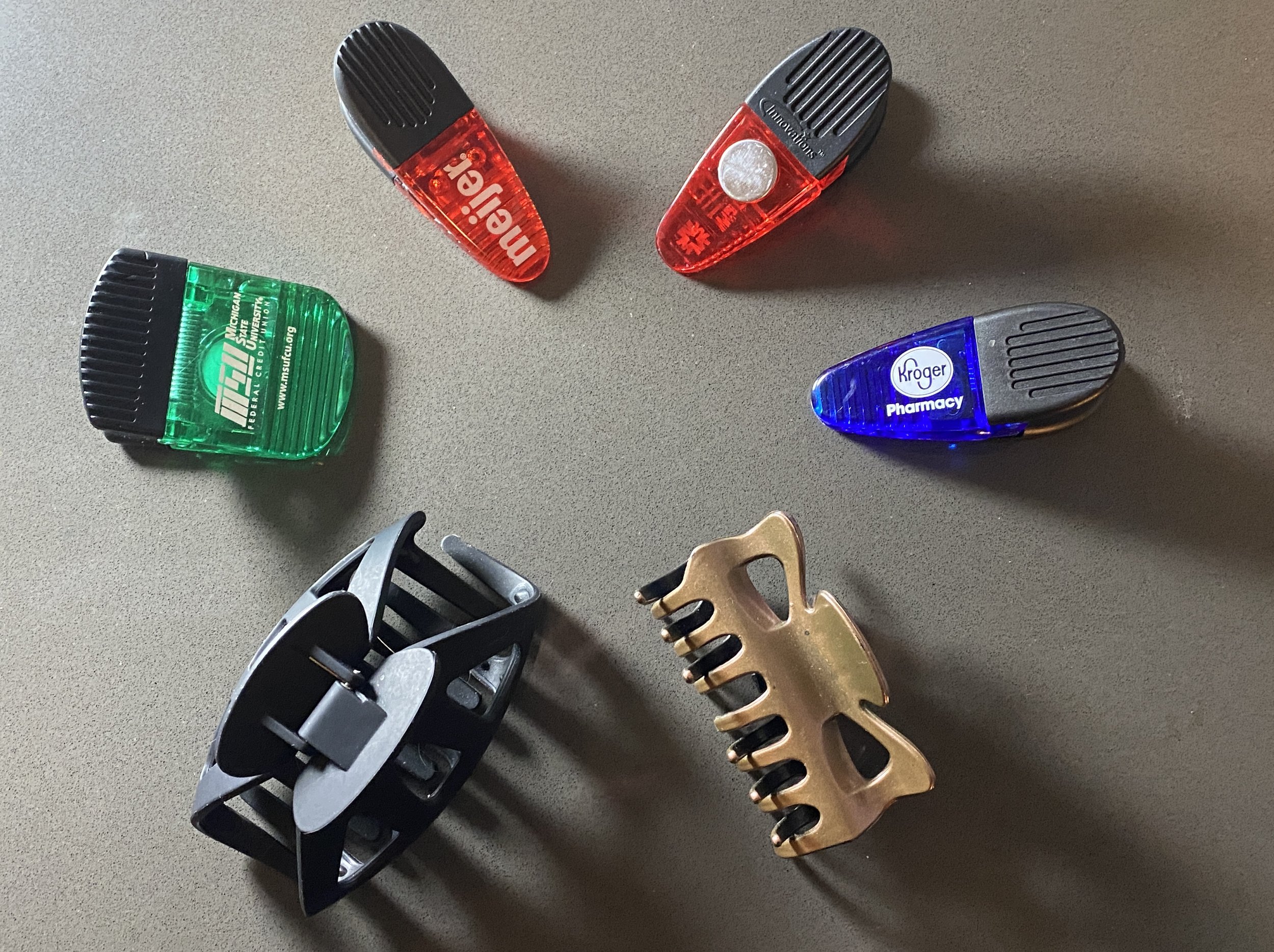
    Without a doubt Magnetic Chip Clips are and were the MVP of my 2023. Need to wear a coat because it’s February but can’t close your coast over your cast? Chip clip it! Need to carry your medical papers and keep them organized? Chip clip them and then stick the clip the fridge! I used the chip clip for showering, for keeping my sling in place, for getting dressed, and for gripping and picking things up.

  2. Hair Claw Clips
    1995 called and said “I told you so!” When you have long hair and want to keep it, but can’t pull it up or braid it, the claw clip is your best friend. If, like me, you worry about claw clips not holding long/thick hair, there are new ones on the market that are super helpful for this scenario. My advice is get several, you never know how many you may need. 

  3. Trash Bags
    Need to take a shower and live alone? Can’t get any of the fancy covers from Amazon or can’t find anything that fits? Trash bags are your friend! Combined with the chip clip, showers are now possible. 

  4. Chisel Tip Sharpie
    Gripping things with weak muscles or when stabilized in particular positions can be extremely difficult. Imagine being asked to sign contracts with in the ER after surgery on your arm? Impossible! The large form factor of the chisel tip sharpies lets you sign things when you need to or write when voice-to-text is not an option. 

  5. Folding Platform Truck
    I originally bought my cart from Harbor Freight for moving by myself. I knew from this experience that it was possible to push and turn this truck with my left arm only. Having this item allowed me to move my groceries from the car (or from a helpful friend’s car) and move things around the apartment and then fold it up (using a foot and my left arm) and keep it stored out of the way. 

Creating Ceramic Glazing Ideas with ChatGPT-3.5

One of the fun (and occasionally frustrating) parts of ceramics is choosing how to glaze a piece. You can choose to glaze pieces in a variety of ways, including layering different glazes to create different colors and effects. Often, glaze company websites will suggest layering combinations and display images of the combos. Social media networks also have groups where people share their glaze combos and images of their own works. 

Last night I was curious what would happen if I asked ChatGPT-3.5 to give me a combination of glazes from a specific manufacturer. I chose to use Amaco as my starting point, as I’ve been working with their glazes for nearly five years. Amaco’s interactive layering guide can be found here: https://www.amaco.com/glazes-and-underglazes/layering

Amaco describes the differences between their different types of glazes their website. For the results of this experiment, I am specifically interested in Potter’s Choice, Celadons and Satin Matte (these are also listed by the frequency with which I work with them). 

For this experiment, I asked ChatGPT-3.5 the same question I might ask a fellow potter: “Suggest a glaze combo of Amaco glazes.” 

Note that this prompt isn’t well engineered — I used “combo” instead of combination, I don’t ask about layering (which is what I meant, but is different from actually combining glazes), I don’t specify ceramics, and I don’t give it a clay body. 

Even with this prompt, ChatGPT pulls the context and suggested a combination that seems reasonable at first glance. With some additional prompting on number of coats and cone (or temperature) at which this combo should be fired, we arrive at a glaze combination that doesn’t give me (and my just under five years of glazing experience) pause…it could work. 

The first two are a combo people have tried before and adding that storm may be unnoticeable depending on the clay body, glaze thickness, etc, so there’s a high chance of success with getting this outcome from this combination(outside of all the factors that go wrong in glazing). 

The noticeable error here is that it labels Seaweed as C-42, which would make a user think this is from the Celadon glaze line (indicated with C-) and not the Potter’s Choice line (indicated by PC-). Seaweed is PC-42; C-42 is the newish Saguaro celadon

In case this was a one-off, I asked ChatGPT-3.5 “Can you suggest me another seaweed glaze combo with three glazes, include the cone, and include the number of strokes.” Here I received a layering combo of Seaweed (still called C-42), Iron Luster and Moss. Moss is mislabelled as C-46 when it is SM-46, there is no C-46. I’m unsure how Moss (a Satin Matte) will interact on top of two PC glazes, but it could be an interesting experiment.

The mislabel on Moss and the previous combo made me curious if all suggested combos would be Potter’s Choice and Celedon glazes and whether it was a certain number of each. I prompted ChatGPT-3.5 with “Can you suggest me another glaze combo with three glazes, include the cone, and include the number of strokes.” On a third run, the combination suggested was Blue Rutile (PC-20), Desert Sage (C-47), and Ancient Jasper (PC-30). Amaco C-47 corresponds to JadeDesert Sage (MBG061) is made by Coyote Clay & Color, a competing glaze company. 

I tried a fourth then out of curiosity, and this one the the one I can’t envision as well as the others: Tangerine (C-50), Smoky Merlot (PC-43), and Rainforest (C-56). First, Tangerine (C-50) does not exist as an Amaze glaze, but Cherry Blossom (C-50) and Tangelo (C-65) do exist. Tangerine (FN-052) is a Mayco glaze. Also, Rainforest is C-49, not C-56. 

After looking at the three experiments following the first, I noticed that I had left “Amaco,” out of these prompts—this meant ChatGPT-3.5 could suggest non-Amaco glazes, which we see in our results. However, they are also marked with Glaze Line and Number Labels meant to correspond with an Amaco glazes (which are wrong) instead of the designations of their home manufacturer. More precise prompt engineering may fix this issue.

I was curious about the glazes I would actually receive in the combinations based on the training endpoint of ChatGPT-3.5. Glaze companies retire glazes and introduce new ones with enough frequency that the training set may be missing the newer glazes and glaze types available.

I was also struck by the fact that ChatGPT-3.5 named the glaze combinations. This made me curious where there names are coming from: Could it be scraping the user groups? Pinterest? Instagram? Is this a creative choice?

This was an interesting exploration for a Wednesday night and it will be an fun to create a few of these suggested combinations, see where the breakdowns are in glaze name/manufacturer/type of glazes, and then try these combinations on test tiles in the future (especially “Sunset Serenade”) !

ChatGPT-3.5 results (Ran 9/20/2023)

(My prompts and initials bolded, beginning of ChatGPT responses bolded)

SV: Suggest a glaze combo of Amaco glazes

ChatGPT: Creating a glaze combo using Amaco glazes can result in beautiful and unique ceramic finishes. Keep in mind that the final result may vary depending on your application technique, firing temperature, and the specific glaze colors you choose. Here's a glaze combo suggestion:

Glaze Combo Name: Ocean Mist

Glazes Used:

  1. Amaco Celadon Glaze - Seaweed (C-34): Apply this as the base glaze. Seaweed is a beautiful, semi-translucent green that gives a calming, earthy tone to your ceramics.

  2. Amaco Potter's Choice Glaze - Blue Rutile (PC-20): Layer Blue Rutile over Seaweed, allowing it to flow and blend with the green base. This combination will create a mesmerizing, ocean-like effect with streaks of blue breaking through the green.

  3. Amaco Celadon Glaze - Storm (C-42): Use Storm sparingly, either as an accent or in specific areas of your piece. This dark gray glaze will create depth and drama in your design, resembling storm clouds in the ocean.

Firing Instructions: Follow the firing instructions provided by Amaco for each specific glaze, as they may vary based on your kiln and clay body. Generally, Celadon glazes fire at Cone 5-6, while Potter's Choice glazes fire at Cone 5-6 or Cone 10, depending on the desired effect.

Make sure to test this glaze combination on a test piece or sample tiles to see how the colors interact and adjust as needed to achieve your desired result. Glaze combos can be somewhat unpredictable, but that's part of the fun and creativity in ceramics!

SV: Add the amount of coats per glaze to the above information

ChatGPT: Certainly! The number of coats you apply for each glaze can significantly affect the final result of your ceramic piece. Here's the glaze combo with the recommended number of coats for each glaze:

Glaze Combo Name: Ocean Mist

Glazes Used:

  1. Amaco Celadon Glaze - Seaweed (C-34):

    • Base Coat: Apply 2-3 even coats of Seaweed as your base glaze. Allow each coat to dry before applying the next for a smooth, even application.

  2. Amaco Potter's Choice Glaze - Blue Rutile (PC-20):

    • Overcoat: Apply 2-3 even coats of Blue Rutile over the Seaweed base. Layering the Blue Rutile will help create the ocean-like streaks and patterns.

  3. Amaco Celadon Glaze - Storm (C-42):

    • Accent Coat: Use Storm sparingly as an accent or in specific areas of your piece. One coat of Storm should suffice to create depth and contrast in your design.

Make sure to follow the recommended drying times between coats and allow your piece to dry thoroughly before firing. Always refer to the specific firing instructions for each glaze to ensure the best results. Testing this glaze combination on sample tiles is highly recommended to fine-tune the number of coats and the overall effect you desire for your ceramics.

SV: What cone should I fire this combination at?

ChatGPT: I apologize for any confusion earlier. Given the glazes you've mentioned, here's the firing cone recommendation for this glaze combination:

  1. Amaco Celadon Glaze - Seaweed (C-34):

    • Fire at Cone 5-6.

  2. Amaco Potter's Choice Glaze - Blue Rutile (PC-20):

    • Fire at Cone 5-6.

  3. Amaco Celadon Glaze - Storm (C-42):

    • Fire at Cone 5-6.

All three of these glazes can be fired at Cone 5-6, which is a mid-range firing temperature. Make sure to follow the specific firing instructions for each glaze, including the recommended ramping and soaking times, as provided by Amaco. Testing this glaze combination on sample tiles at the Cone 5-6 temperature range is a good practice to ensure you achieve the desired results on your ceramics.

SV: Do I go in order of 1, 2, and then 3?

ChatGPT: Yes, when applying multiple glazes in layers, it's typically recommended to follow a specific order to achieve the desired effects. In this case, you should go in the following order:

  1. Amaco Celadon Glaze - Seaweed (C-34): Apply this glaze as the base coat. It's the first layer you should apply to your ceramic piece.

  2. Amaco Potter's Choice Glaze - Blue Rutile (PC-20): Apply Blue Rutile over the Seaweed glaze. This is the second layer, and it should go over the first layer (Seaweed).

  3. Amaco Celadon Glaze - Storm (C-42): Use Storm as an accent or in specific areas of your piece. This is the third layer and should go over the previous layers (Seaweed and Blue Rutile).

By applying the glazes in this order, you allow the glazes to interact and create the intended visual effects. Remember to follow the recommended number of coats for each glaze, as mentioned in previous responses, and allow each coat to dry before applying the next. Additionally, make sure to follow the firing instructions provided by Amaco for each glaze to achieve the best results.

SV: Can you suggest me another seaweed glaze combo with three glazes, include the cone, and include the number of strokes

ChatGPT: Certainly! Here's another glaze combination using Amaco Celadon Glaze - Seaweed (C-34) as the base glaze with two additional glazes. I'll also include the firing cone and the recommended number of strokes for each glaze:

Glaze Combo Name: Forest Canopy

Glazes Used:

  1. Amaco Celadon Glaze - Seaweed (C-34):

    • Base Coat: Apply 2-3 even coats of Seaweed as your base glaze.

    • Number of Strokes: Apply each coat with smooth, even brush strokes for consistent coverage.

  2. Amaco Potter's Choice Glaze - Iron Lustre (PC-21):

    • Overcoat: Apply 2 coats of Iron Lustre over the Seaweed base.

    • Number of Strokes: Apply each coat with 2-3 even brush strokes for a slightly textured, rustic effect.

  3. Amaco Celadon Glaze - Moss (C-43):

    • Accent Coat: Use Moss sparingly as an accent or in specific areas of your piece. One coat of Moss should suffice.

    • Number of Strokes: Apply Moss with a lighter hand, using 1-2 brush strokes to create subtle accents.

Firing Cone: Fire this combination at Cone 5-6, following the specific firing instructions for each glaze provided by Amaco.

As always, testing on sample tiles or test pieces is highly recommended to ensure the desired results and to fine-tune the number of strokes and application techniques for your specific project.

SV: Can you suggest me another glaze combo with three glazes, include the cone, and include the number of strokes

ChatGPT: Certainly! Here's another glaze combination using three different Amaco glazes, along with the recommended firing cone and number of strokes for each glaze:

Glaze Combo Name: Desert Oasis

Glazes Used:

  1. Amaco Potter's Choice Glaze - Blue Rutile (PC-20):

    • Base Coat: Apply 2-3 even coats of Blue Rutile as your base glaze.

    • Number of Strokes: Apply each coat with 2-3 smooth brush strokes for consistent coverage.

  2. Amaco Celadon Glaze - Desert Sage (C-47):

    • Overcoat: Apply 2 coats of Desert Sage over the Blue Rutile base.

    • Number of Strokes: Apply each coat with 2-3 even brush strokes for a serene, semi-translucent effect.

  3. Amaco Potter's Choice Glaze - Ancient Jasper (PC-30):

    • Accent Coat: Use Ancient Jasper sparingly as an accent or in specific areas of your piece. Apply one coat of Ancient Jasper.

    • Number of Strokes: Apply Ancient Jasper with 1-2 brush strokes to create subtle highlights and variations.

Firing Cone: Fire this combination at Cone 5-6, following the specific firing instructions for each glaze provided by Amaco.

As always, conduct test firings and glaze applications on sample tiles or test pieces to ensure the desired results for your specific ceramics project. Adjust the number of strokes or layering technique as needed to achieve your desired aesthetic.

SV: Can you suggest me another combo with three glazes, include the cone, and include the number of strokes

ChatGPT: Certainly! Here's another glaze combination using three Amaco glazes, along with the recommended firing cone and number of strokes for each glaze:

Glaze Combo Name: Sunset Serenade

Glazes Used:

  1. Amaco Celadon Glaze - Tangerine (C-50):

    • Base Coat: Apply 2-3 even coats of Tangerine as your base glaze.

    • Number of Strokes: Apply each coat with 2-3 smooth brush strokes for consistent coverage.

  2. Amaco Potter's Choice Glaze - Smoky Merlot (PC-43):

    • Overcoat: Apply 2 coats of Smoky Merlot over the Tangerine base.

    • Number of Strokes: Apply each coat with 2-3 even brush strokes for a rich, layered effect.

  3. Amaco Celadon Glaze - Rainforest (C-56):

    • Accent Coat: Use Rainforest sparingly as an accent or in specific areas of your piece. Apply one coat of Rainforest.

    • Number of Strokes: Apply Rainforest with 1-2 brush strokes to create subtle highlights and variations.

Firing Cone: Fire this combination at Cone 5-6, following the specific firing instructions for each glaze provided by Amaco.

As always, conduct test firings and glaze applications on sample tiles or test pieces to ensure the desired results for your specific ceramics project. Adjust the number of strokes or layering technique as needed to achieve your desired aesthetic. This combination should result in a vibrant and dynamic finish reminiscent of a beautiful sunset.

AUGMENTED REALITY USING THE DELAWARE WATER GAP NATIONAL RECREATION AREA: PART 2—SOUNDSCAPES AND ADOBE AERO

Unfortunately, the second part of this series was delayed as I healed from several injuries to my dominant arm. Now that I’m on the road to recovery and will be presenting some of this work at the 2023 HASTAC conference, I’m able to share this next part with you.

As a reminder from the last post, in the Spring of 2022, I had the opportunity to start work on a pilot project creating interactive experiences of structures within the Delaware Water Gap National Recreation Area combining augmented reality (AR) and soundscapes. This initial work uses a combination of 3D renderings of structures created using the photogrammetry mode of the Polycam app and sounds captured with an iPhone to create interactive experiences using Adobe Aero. In part one, I gave an introduction to the project and talked about the photogrammetry portion of the project. In this post, I'm going to cover the sound capture and the Adobe Aero portions of the project. For the purposes of this post, when I use the phrase “digital asset or “asset,” I am referring to things like audio files, photogrammetric scans, photos, or video. When talking about my phone and my iOS experiences, I am referring to an iPhone 11 Pro.

Soundscapes
Initially, I had wanted to capture soundscapes in situ at the structures using a Zoom handheld recorder. While this may have provided higher sound quality, I ultimately chose to record via iPhone voice memos to explore the ability to create AR experiences with the least amount of equipment possible. By using only the phone, I eliminate the need to carry extra equipment, which has implications for a variety of conditions under which one might want to collect digital assets, such as backcountry hiking/exploration. From a changing ecosystem and park use perspective, one soundscape for an experience may not be enough to reflect the diversity of the land as the seasons and conditions change. For example, the amount of visitors at the park, hunting seasons and shooting ranges on lands near the park, and mating seasons will all impact the collected soundscape. 

Adobe Aero
I chose Adobe Aero for this project for several reasons, chief among them the barrier to entry for someone new to AR. It is free, there exist tutorials, and it does not require the steep learning curve and resources that Unity would have. I also was drawn to Aero because it allows me to link audio and visual assets through the Behaviors settings. It’s important to note that Adobe Aero is available for iOS, but is in beta release for Mac and Windows desktop. While it is possible to create an entire experience from asset collection to processing to constructing and deploying the AR experience on iOS with the app, I personally find it much easier to collect my assets and then work with the beta desktop version for Mac (for me, a MacBook Pro 2017 (RIP), MacBook Pro 2023). 

The workflow that works best for me is to capture my assets (soundscapes and photogrammetry) in situ on the phone at my site of interest and then work from them at home on the desktop version of Aero.*

First, I prep the assets. For the 3D model, I use a .glb file from Polycam. With a pro subscription, Polycam provides users with several different export types. Determining which would work with Adobe Aero required experimentation, I ultimately found that the .glb file export was the option that worked for me. On the free/trial version of Polycam, .glb is the only export option. For the audio files, because the sound recordings on an iPhone save as .m4a files, I convert them on desktop to .wav versions in Apple Music and then use the .wav within Aero.

To build the experience in Aero, I start a new experience and add the .glb file. I rotate and resize the model and place it in coordinate space as I would like it to appear. Then I open the Behavior menu in Aero, add a Proximity Entrance trigger, choose the model as the subject, select the distance at which it activates, and decide on the re-triggering criteria. I add a play audio action, choose the subject to be the model, upload my audio file, and adjust the play count if needed. From there, I am ready to test my AR experience.

While Adobe Aero was an interesting tool for this pilot; it is not without limitations. First, Aero is only available to iOS users and requires a Creative Cloud account to view the experiences. This drastically lowers the availability of the experience to potential audiences. Second, I’ve recently had cross-platform issues when working on an experience: if I made edits in the app version, I could no longer access the experience in the desktop version.

Example: Lower Treible House (A structure at Peters Valley School of Craft)
Below is test footage of an AR experience created in Adobe Aero using a model built on a photogrammetric scan of the Lower Treible House from Polycam combined with audio recorded next to the structure in the parking lot on a different day (same week) as a voice memo. The audio is proximity entrance triggered. I’m beta testing this app in a hotel room. (Updated on 6/9/2023 with new example).

Closing Notes
Ultimately, I consider my pilot to create AR experiences quickly with minimal equipment a success. However, I do believe that combining LiDAR scanning with drones for the photogrammetry and specific recording equipment for outdoor soundscape capture would yield a higher quality augmented reality experience. However, for beta tests and pilot projects, my iPhone and MacBookPro were enough for me to create an interactive experience quickly and cheaply. In an ideal case, I would love to design these experiences on a platform that is free, operating system agnostic, and does not require an additional log-in step.

———————————————————————————————————-

*I have found that you can to create the whole experience on an iPhone by saving the .glb to your phone and doing the audio file type conversion in GarageBand It may take a little bit longer depending on the size of the glb file.

Augmented Reality using the Delaware Water Gap National Recreation Area: Part 1—Introduction and Photogrammetry

As a native of Warren County, NJ, I grew up spending time in the Delaware Water Gap National Recreation Area (DWGNRA) hiking, checking out lakes and waterfalls, and visiting Millbrook Village. As an adult and a scholar, I am drawn to the complicated, but unknown by many, history of the DWGNRA involving the proposed and never constructed Tocks Island Dam, the use of eminent domain to claim land and structures, and the creation of the area itself. For the past several years, I have focused a portion of my work on artistic representation of the DWGNRA and creating a practice both informed by and sited (when possible) within the area.

This past spring, I had the opportunity to spend at week at Peters Valley School of Craft in Layton, NJ to work on a pilot project creating interactive experiences of structures within the DWGNRA combing augmented reality (AR) and soundscapes. This initial work uses a combination of 3D renderings of structures created using the photogrammetry mode of the Polycam app and sounds captured with an iPhone to create interactive experiences using Adobe Aero. Ultimately, I would love for visitors to the DWGNRA, historians, scholars, and other interests parties to be able to experience the sights and sounds of these structures from anywhere. 

My week at Peters Valley consisted of traveling to structures within the NJ side of the part, capturing scans in Polycam, collecting soundscapes, and testing combinations with Aero. Each of these areas came with its own unique challenges that I’ll visit over

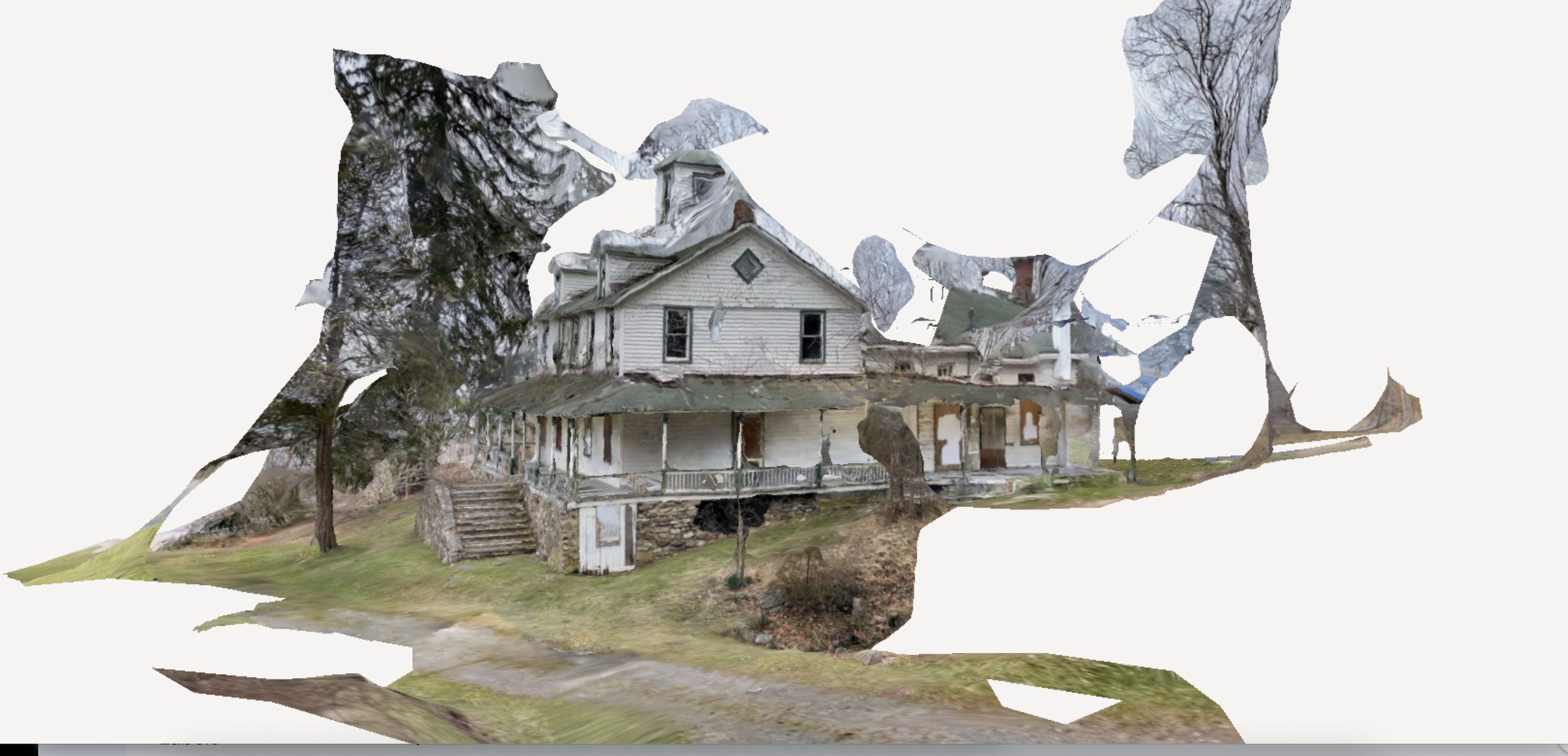
Today, as part of this three part series, I am focusing on the photogrammetric scans in Polycam. For the 3D models, I hoped to collect undistorted, 3D views of the entire structure. This is complicated due to a variety of factors. The best scans required flat light (cloudy days) to minimize shadows from the structures and from surroundings. These scans also need to be collected from the same height for the perimeter, which was difficult due to uneven ground or neighboring structures. Creating scans with high fidelity for size and detail meant finding a distance from the structure to capture the scan that balanced detail and capturing the whole structures: too close meant losing features for the geometry, too far could mean losing detail. Also, as I was often capturing building in a state of decline and decay, the warps, destruction, and missing pieces proved difficult to capture, as did clear glass windows (due to reflections, light, etc) or missing windows. Depending on the level of detail and the size of the structure, changing between Medium and Full processing within the app also changed the fidelity of the scan. Some example scans are below.

Delaware View House/Salamovka. Note the issues with roof features due to my height versus height of structure and the foliage interfering with the scan due to proximity, but also note the detail of the paneling and the stone work on the front steps and lower level. 

Lower Treible House/Peters Valley School of Craft. Again, issues with roof but mostly captured due to flat, even 360 path around the house. Additional issues with window reflections and foliage. 

Some Polycam Suggestions

-Aim for flat, soft light

-Minimize shadows

-Minimize, if possible, additional elements near what you are scanning

-Use object masking mode for smaller objects (smaller meaning less than person-sized in the author’s experience)

-Chose your detail level based on your objective: I use full because I want a detailed, life-like structure, but for your purposes, optimized or medium may work as well

-For smaller objects (e.g. a ceramic coffee cup), place the object on a uniform (color, texture) surface if you would like to edit it out

-Aim to collect a 360 degree scan and plan your route around the object ahead of time

-Create AT LEAST ONE circle of images at the same height/distance from the object (full 360). As you move 360, collect additional angles of the object (tilt the camera), but always collect an image from the same height/distance for the full 360. Do also remember to collect top and bottom images if you go as possible.

-Remember you can edit individual images out after you collect a scan if you accidentally collect an image you don’t like or contains a finger or person

I am currently drafting a paper based on this work. If you have any suggested journals, please reach out to me via LinkedIn!


Transformation Tuesday: MSU Food Literacy and Engagement Poll

It’s Transformation Tuesday, a new feature on the blog! Every Tuesday I’ll showcase a website or product and how I might use UX research and design to make improvements.

This week I’m featuring a redesign mockup and research plan I presented to the MSU Food Literacy and Engagement Poll group a few months ago. This redesign plan centered on refreshing their webpage to 1) increase downloads and use of their poll results and 2) make information about the poll more transparent to users. Unfortunately, due to some role changes, this group needs significant time before working on their web presence, so this project stayed in the concept staged. As a disclaimer, I receive funding from AgBioResearch and have for several years.

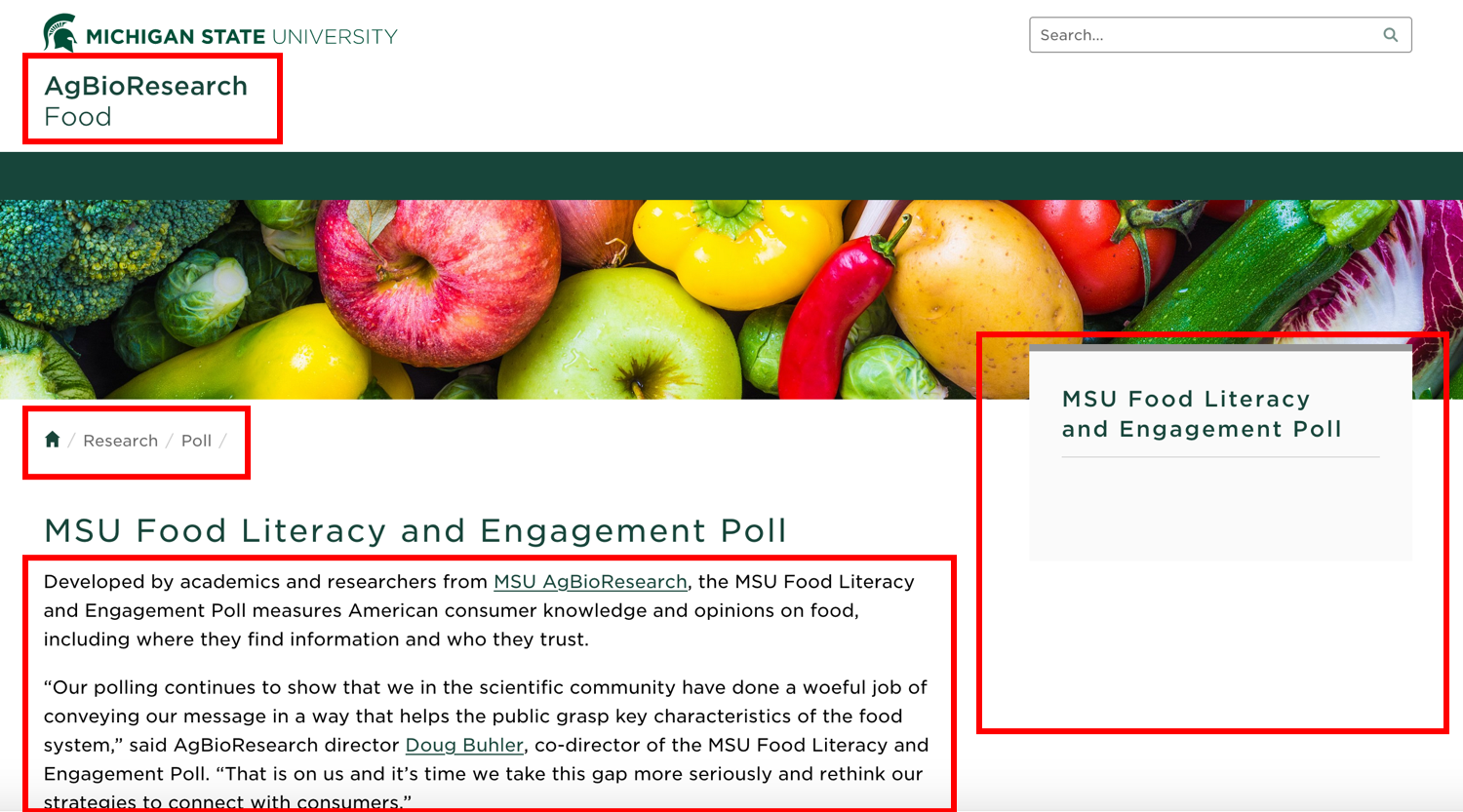
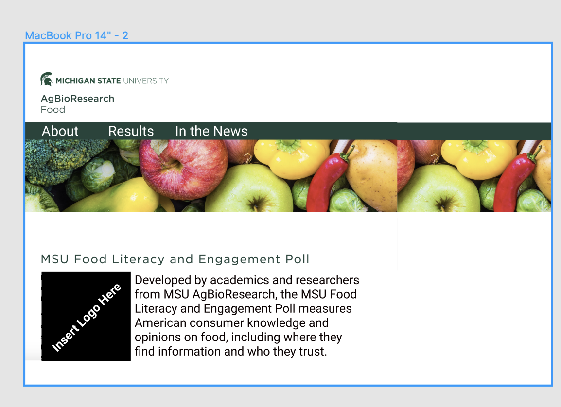
First, let’s take a quick look at the the landing page for the MSU Food Literacy and Engagement Poll Right away. While I know that the poll is interesting and yields important information, it’s hard to know where one would go to access information about the poll or poll results from this landing page.

Right away, there are several areas for improvement, as highlighted by the red boxes. The navigation indicated by “AgBioResearch/Food” doesn’t match “Home/Research/Poll.” The righthand side nav box is empty. Finally, the copy below the title has a good first sentence, but the the subsequent content could be moved elsewhere and some additional explanation content could be added. 

Assuming this is a project with a two-month time frame (short for academia) with a minimal budget, my hypothetical plan for a simple refresh for this page to increase its functionality and usability would be as follows: 

1) Conduct User Interviews: Structured, virtual interviews with members of poll team, previous poll data users, individuals who have written about the poll. Interview questions would focus on why and how users have interacted with the page, what their pain points are, and suggestions for improvement. The sample size for this would depend on project budget and how many users it took to reach saturation for findings. I’d take info from these interviews, synthesize them into top three findings, and use these findings to drive changes to the current design.

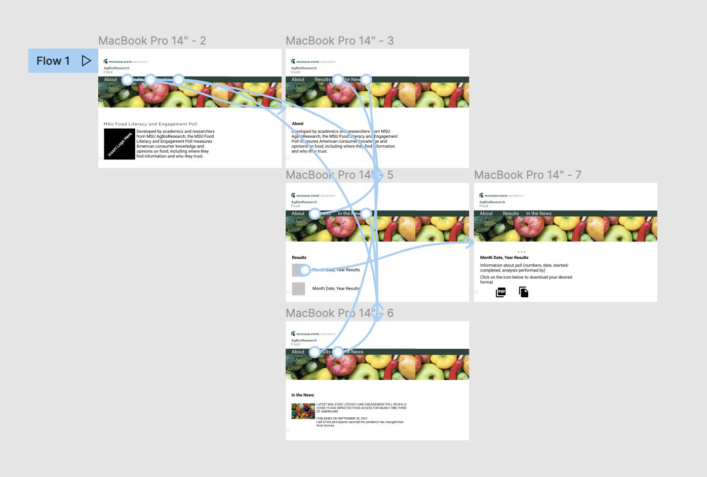
2) Create Design Prototype: Use feedback from interviews to create a prototype new site in Figma. This might look like the image below. Some items I image might be needed based on my own analysis of the site: easily digestible information on how the poll was conducted, link to a page where different years of poll results could be downloaded, and a page of how poll data has been used. I’d create some additional pages for these items and design an information architecture and flow that made sense for users.

3) Usability Testing Round 1: Virtual moderated usability testing using Design Iteration #1 to test if individuals can access info about the poll, poll results, and contact info for the poll. Again, the sample size for this would depend on project budget and how many users it took to reach saturation for findings. Results from this would drive the design of the new website.

4) Create new website: Use results from usability testing and design prototype to edit existing website.

5) Monitor site analytics to understand user journeys on this website. I’d also compare pre-transformation pick up of poll results and downloads of poll data to post-transformation of these counts.

6) Create 1-page research and progress brief for stakeholders: I would create a 1-page document for the stakeholder group outlining the challenge, the research methods and results, and the potential future opportunities. Results from the user interviews and usability studies would be presented visually.

Final note: With an expanded budget and timeline, I’d run multiple rounds of design iterations and usability testing, as well as introduce an open card sort to make sure i am capturing all of the categories those who conduct and use the poll need. I would also, after a few months, run a focus group of individuals who have used the poll to understand their impressions and feelings about the new site.

Design Remix: Improving the MSU COVID-19 Vaccination Form

Introduction
When I first saw the MSU COVID-19 Vaccine Form, I was a bit dismayed by the UX on it. The University has had some time here between the mandate and launching the portal to create an experience that makes people feel safe (both about coming to campus and entering their data). After conversation with several colleagues about this form, I’ve decided to create this short post on ways to improve the experience and the trust in the process. 

Before we get started, I think it’s important to check my own positionality. I am a pro-vaccine, pro-science, cisgendered woman who has worked at MSU for six years as both a postdoc and an academic specialist. I received the Pfizer vaccine as a result of volunteering with Ingham County Health Department through MSU; I served all four of my shifts at the MSU Ag Pavilion. 

Also, we know that survey design is hard. You need to balance providing information, collecting information at the right granularity, providing an engagement experience, and making sure the length of the survey doesn’t create survey fatigue.

What are we trying to solve?
Collecting information on vaccine status of an entire university, including faculty, staff, and students.

Critiques and places for improvement:
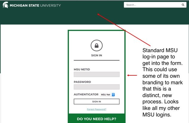
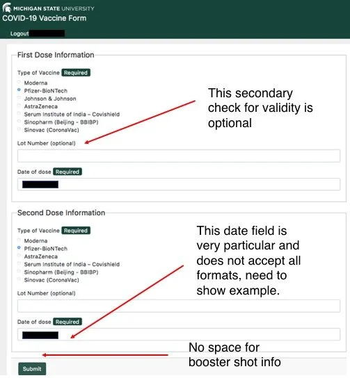
These are not clean new mockups, rather, I’ve commented on screenshots of the app with some critiques and suggestions for change.

Form2.jpg
Form3.jpg

Questions to think about:
-Dearth of information: How is this information being verified (if it is)?
-Has MSU hired staff to do this verification?
-How could you actually verify this data? Especially as some of it will not just be Ingham County Health Department, but sites all over the world and multiple types of vaccines?
-Could the initiative working on this talk to the UX/XA scholars on campus to create a better experience for the MSU community?

Lessons learned/Suggestions:
-Finding a clear, non-onerous solution to collecting and verifying this information is hard problem to solve. However, across the board, this form needs more information, especially around data security, privacy, use, verification, community updates.
-I think starting with why MSU chose to do a vaccine mandate upfront would also be helpful, as well as when data is covered by HIPAA and when it is not. 
-This may be the first time mandatory vaccines need to be recorded in this fashion. Now is the time to build a portal that builds trust in your community. This Qualtrics-esque portal did not do that for me. 
-No email upon completion with a link back to updates is an easy fix that should be implemented ASAP, it could also include links to COVID-19 resources on campus

Takeaways/Final Comments
I was slightly nervous to post this critique, but I think it’s important that we open the discourse on surveys and forms in the University context and that we think, as a community, about the ways that information flows within the University (especially with respect to COVID-19 and decisions around campus safety.

Form3.jpg

Applying the Science of Team Science to Formula 1

Once again, it’s time for the annual International Science of Team Science Conference!

At the conference this week we’ve talked a lot about academic teams and science research teams, but I also want to reflect on how I think about the science of team science in non-academic contexts. For those who aren’t familiar, the National Cancer Institute’s Collaboration and Team Science: A Field Guide describes team science as “as a collaborative and often cross-disciplinary approach to scientific inquiry that draws researchers who otherwise work independently or as coinvestigators on smaller-scale projects into collaborative centers and groups.” Those who study the science of team science studies these teams, their processes and outcomes, and the types of interventions that may be helpful.

As an avid Formula 1 (F1) fan and a team science/science of team science researcher, I spend a lot of time during race weekends thinking about the ways that the science of team science can be applied to F1 and the types of team science interventions that might improve team performance. F1 teams are multiteam systems, where teams of engineers, mechanics, and strategists (among others) work together towards a common goal or goals. These teams themselves can also be multi- or interdisciplinary, bringing together individual with different expertise. Depending on a team, goals could include the Constructors' Championship, the Drivers’ Championship, winning a race, a podium finish, or even just finishing in the points. Forming a successful F1 team capable of achieving any of these goals requires multidisciplinary leadership, as well as functional communication, collaboration, and team processes.

While not a perfect tool for every situation, the 10-step collaboration plan developed by Hall, Crowston, and Vogel works as an introduction to the wide variety of aspects a team must consider when collaborating towards a common goal, including: rationale for team approach and configuration, collaboration readiness, technological readiness, team functioning, team communication & coordination, leadership/management/administration, conflict prevention and management, training, quality improvement activities, and budget & resource allocation.

I’m not going to cover all ten aspects in this post, instead I’ll focus on team communication & coordination and team functioning, which are the areas plaguing most of the teams this season.  I do want to note that as fans, we see very little of the behind-the-scenes work at these teams, which can make commenting on these areas somewhat speculative. What I discuss below relies on messaging that comes from teams, observations during races and interviews, and historical data. 

Team Communication & Coordination
As mentioned above, F1 teams are multiteam systems that require an immense amount of interteam leadership and communication. During a race, however, the majority of communication takes place between a driver and their race engineer (with occasional input from a team strategist and team principal as well). The race engineer is in charge of relaying the information from strategists to the drivers. This requires rapid synthesis of communication from different disciplines by members at the track and at the home base of the team that then is delivered to a driver in quick, understandable messages.  

Last weekend during the Azerbaijan Grand Prix, we saw the importance of team communication and the damage that poor communication can play. Nicolas Latifi’s race engineer instructed him to “stay out” during a red flag when Latifi should have come down the pitlane. This miscommunication resulted in a 30 second penalty for Latifi, as well as three points on his super license.  

It is critical that F1 drivers and their race engineers are able to communicate at a frequency that is comfortable for both the driver and engineer and that they use terms that are understood by both. Adding a challenge to team communication is the fact that F1 team radio communications are available to all teams during a race, so your competitors are able to hear your in-race communications. This makes the development of an agreed-upon common language, including code phrases, all the more important.  

In terms of coordination, the use of team orders can be contentious if not discussed and agreed upon prior to a race. Team orders, where a team can tell a driver to let the team’s other driver pass or to hold position, are a longstanding area of controversy in F1. The fact that these have moved from legal to illegal and back to legal again has not helped this. The “Valtteri, it’s James,” radio call from James Vowels (Mercedes Chief Strategist) to Valtteri Bottas during the 2018 Russian Grand Prix, which led to Bottas ceding his place in the race to Lewis Hamilton, is one of the more blatant examples from the recent F1 era. However, team orders persist even as recently as this year during the Emilia Romagna Grand Prix, where team orders from McLaren instructed Daniel Riccciardo to let Lando Norris pass for position. If teams are not addressing the use of team orders in their communication and coordination plan, they are setting themselves up for another area of concern: conflict management.  

Team Functioning
According to Hall, Vogel, & Crowston, team functioning takes into consideration how teams bring together their unique characteristics and how they think about achieving their key processes.  

Team functioning can be impacted when adding additional members to a team. At McLaren, Daniel Ricciardo has been struggling with his move from Renault (now Alpine) while younger teammate Lando Norris (currently in his third year driving for McLaren) hasn’t finished lower than eighth in a race this season. Pundits question if this is the end of Ricciardo’s career and if moving to McLaren was the right move, while McLaren have publicly supported Daniel’s time getting up to speed and have incentivized Daniel to podium (which, it should be pointed out, they have not done for Norris). Last year, many fans were excited for the pairing of Norris and Ricciardo at McLaren, but so far, they have rarely appeared together and the “meme-squad” many were anticipating has not come to fruition. The combination of Ricciardo and Norris’ performances, their treatment by the media and fans, their unique strengths and the need to have both in the points in order to ensure team success point to McLaren’s need to focus on process. Using the team science framework would help McLaren improve perception & teamwork off the track and performance on the track. As a Toolbox Dialogue Initiative researcher, I think a TDI workshop focused on surfacing views, values, and assumptions through philosophically-guided discussion between the drivers and the leadership could kickstart that process discussion. I’ve been bold enough in the past to email CEO Zak Brown, so email me back Zak and let’s talk about how to do this together!

Over at Red Bull, concerns about their team dynamics have persisted for years. Many perceive Max Verstappen to be the favored driver at Red Bull, with the second seat being “cursed.” In the past four years, four different drivers have occupied this seat, with the pressure and scrutiny of being in this seat being potential contributing factors to these short-term tenures. As a science of team science researcher, I’d love to be embedded in the Red Bull day-to-day operations to see how the team dynamics here actually play out. Here’s a team where investigating additional pieces of the collaboration plan, such the leadership style as it plays out with Red Bull Advisor Dr. Helmut Marko and Team Principal Christian Horner, may influence a second driver’s team functioning (as well as psychological safety).

Back to Williams, the change in leadership announced on Wednesday is also the perfect time to think about team functioning and spend time focusing on process. As current CEO Jost Capito moves into a hybrid Team Principal/Team CEO role and current Team Principal Simon Roberts departs, communication and role responsibilities within the team will change, Williams has an opportunity to rethink their structure, process, and organization. While disruptive, Williams could hold a series of open internal conversations, trainings, and leadership discussions which could yield a stronger organization during this season. However, as Russell’s future is also up in the air, Williams may need to have several iterations of these discussions if they bring on a new driver for the 2022 season.

Finally, a word about Mercedes. If this was any other year, I might not mention them, but this year, the cracks are showing. Mercedes seems to be going through an interesting period where they need to revisit many parts of a collaboration plan, including leadership, communication, conflict management, and potentially budget after that Bottas/Russell incident at Imola. For example, Toto Wolff’s “no blame” culture is falling by the wayside this season, Bottas’ performance and demeanor comes across as a combination of demotivated/demoralized/unincentivized, and even Lewis Hamilton has started to blame the team in public comment after Monaco. Even if this is, as rumors suggest, Bottas’ last year with the team before Russell steps in, an immediate focus on process and communication might help Mercedes stop publicly detonating and making costly mistakes.

Concluding Thoughts
F1 teams would benefit from the inclusion of science of team science, specifically an attention to process, communication, and collaboration. Preparing now to spend the offseason focusing on process and coming into 2022 pre-season testing with communication, conflict management, and leadership sorted out could make the difference in achieving goals for many of these teams.

Hopefully this blog post spurs my fellow science of team science/team science members to think about the applications of our work beyond the lab and beyond academia. Please let me know if you’d be interested in seeing these ideas developed into additional blog posts! Also, to any F1 team members reading this, I’d love to chat with you about team science/science of team science or work with you on collaboration planning and team functioning! Please contact me!

“Welcome to Portimão!” Or “Why I Thought About Modeling This Race and Decided Against It”

It’s time for the third race of the 2021 F1 season, the Formula 1 Heineken Grande Prémio De Portugal! This racetrack, the Autodromo Internacional do Algarve, is usually referred to as Portimão, which is how I’ll be referring to it in the rest of this post. It’s exciting to be back into the swing of the F1 season after Bahrain, Imola, and the extended break between those (plus the two week break since Imola). I enjoy Portimão on the schedule because the time zone math gives me an extra hour to grab a quick jog and a coffee on Sunday morning.

As my day job has mostly focused on designing and delivering events this year, I haven’t had many opportunities to code. F1 is a data-driven sport, which is part of why I enjoy it, and can be a great resource for data to practice data visualizations of creating machine learning models. Earlier this week, I thought about modeling this race and making predictions about winners. Ultimately, I decided not to for several reasons and I decided it’s important to unpack the reasoning behind why you might not want to model/predict a certain event or outcome. I’ve broken my reasoning down into a few categories:

Lack of Races at Portimão: F1 has raced at Portimão once (2020), so there’s a lack of historical data.

2021 Driver Swaps/New Lineups: Let’s start with the low-hanging fruit: Haas. Two brand new drivers in their lineup this year, both of whom lack previous F1 experience, making this their third F1 race ever. The only real prediction we can make with some certainty is that Mazepin does a Mazespin sometime over the weekend. In terms of other new drivers, Tsunoda at Alpha Tauri has promise to crack the top 10, but he needs to stay consistent.

This week there have been a plethora of videos about how the drivers who have swapped teams this year aren’t adjusting quickly. Vettel is looking dreadful in the Aston Martin, Checo had a pretty horrible race last outing with Red Bull, Ricciardo couldn’t hold his own against Norris and got team ordered in McLaren, Alonso is back and driving for Alpine but hasn’t impressed, and Sainz is just okay in the Ferrari.

Only 12/20 of this year’s drivers raced last year with their same team: Hamilton and Bottas (Mercedes), Norris (McLaren), Leclerc (Ferrari), Giovinazzi and Raikkonen (Alfa Romeo), Latifi and Russell (Williams), Ocon (Alpine (but Renault)), Stroll (Aston Martin (but Racing Point)), Gasly (Alpha Tauri), and Verstappen (Red Bull).

Season/Track Conditions: Last year, Portimão was Round 12 and took place in October. This year, Portimão Is Round 3 and takes place April/May. This may make a huge difference for getting the tires warmed up. As mentioned above, we’ve a plethora of new drivers, returning drivers, and drivers who have swapped teams. 2021 has seen a shortened testing period, a shift in the first race from Australia to Bahrain, and a dry (Bahrain) and wet (Imola) race. Drivers are still adjusting to their cars this year and we haven’t seen two races under the same conditions yet.

Portimão was a late addition to lineup last year and track conditions were questionable. We saw extensive track repairs needed last year, especially after Vettel’s incident with a drain cover in the third practice. Hopefully this year we see improved track quality/conditions.

Low- vs. High-Rake: I won’t subject you to Otmar Szafnauer-levels of complaining about how FIA’s regulation changes this year may be affecting low-rake cars more than high-rake cars, but we have seen Mercedes and Aston Martin struggle a bit at the beginning of this season. Hamilton is still working his hardest to get that Merc where it needs to be, but I think we’ll continue to see this low/high-rake drama continue to play out. With the regulation change and only two races under it, modeling again becomes uncertain for current conditions.

The Bottom Line: A lack of historical data in general, lack of driver data for eight of the drivers in their current teams, drastically different seasons between the only two races (2020/2021), and changes in FIA regulations in the last year all gave me pause in creating a model for this race and doing data-driven predictions based on historical data.

That said, do I think we’ll see many of last year’s top 10 in this year’s top 10? Absolutely. I think ( & hope for the sake of my Fantasy F1) that Norris moves up into the points here, which is possibly based on his last two races (P4, P3). I don’t think Vettel will crack the top 10. Predicted Winner: Verstappen.

TL; DR: Too many caveats, not enough data, no confidence in predictions. Looking forward to an interesting weekend!

How do online and in-person events differ?

Thinking about how your online events might differ from your in-person events? Here’s ten differences and some suggestions on what you can do as a facilitator.

Accounting for time zones

Virtual trainings can allow for participation from individuals in many different time zones. This requires the facilitator to find times that allow for maximum participation without putting a very early morning/very late evening burden on participants living in particular time zones.

Engagement/Distraction

During in-person trainings, it may be easy for a facilitator to spot if a participant is multitasking, checking their phone, or is otherwise distracted. This can be harder to manage and spot with virtual events; building in frequent interactive components and breaks into a virtual training can help increase engagement.

Space and Space Requirements

In an in-person training, a facilitator (or organization) is responsible for finding a suitable space for all participants. A downside to virtual training sessions is that sometimes facilitators can assume that all participants have access to an adequate space for the training session. Some participants may not have access to their own space or a space free from distractions. This needs to be considered in offering the workshop and in setting ground rules and norms (i.e.-stating that it is okay not to turn your video on, etc.).

Equipment and Equipment Requirements

Not all participants may have access to a laptop with a camera or external microphone. Not all participants will have access to reliable, stable internet connections. This also needs to be considered in offering the workshop and in setting ground rules and norms.

Accessibility

While both virtual and online trainings require accessibility considerations, virtual events may require different considerations. One example would be live captioning for video conferencing tools.

Technological readiness of the audience

When choosing a platform or tool to use for online training sessions, it is important to consider if the entire audience is familiar with it or if the tool itself will be the cause of confusion and delays within the training.  Understanding the technological readiness of the audience can be accomplished by administering a short survey prior to the workshop.

Platform-induced unconscious bias

Use of video platforms can induce unconscious bias in multiple forms, including how participants interact with the platform (ex: Dr. Amy Bonomi from MSU talks about how custom backgrounds could reinforce particular cultural norms: https://msutoday.msu.edu/news/2020/theres-an-unconscious-bias-in-virtual-meetings-heres-how-you-can-avoid-it/). Facilitators can suggest that participants try to find neutral backgrounds, but this may be influenced by space and space requirements and will require facilitators to balance their pre-training instructions with this in mind.

Participation Numbers

Depending on the type of training and the time it is offered, the number of participants and/or interest for a virtual event may be greater than for an in-person event. Given the impact of COVID-19 on many workplaces, this may remain true for the foreseeable future and may require adding additional sessions and facilitators.

Communicating preparation and expectation

Virtual trainings require additional communication from the facilitators. This can include (but is not limited to) information on the particular tool being used, a guide to that tool if it is new for participants, and some norms of participation (i.e., around cameras and microphones) that may differ from in-person trainings.

Nonverbal Cues

Nonverbal cues are one way that facilitators perceive how participants are engaging with a training in person and can be easier for a facilitator to notice and adapt to in person than online. For online trainings, it may be necessary for facilitators to build in regular check-ins with the participants.